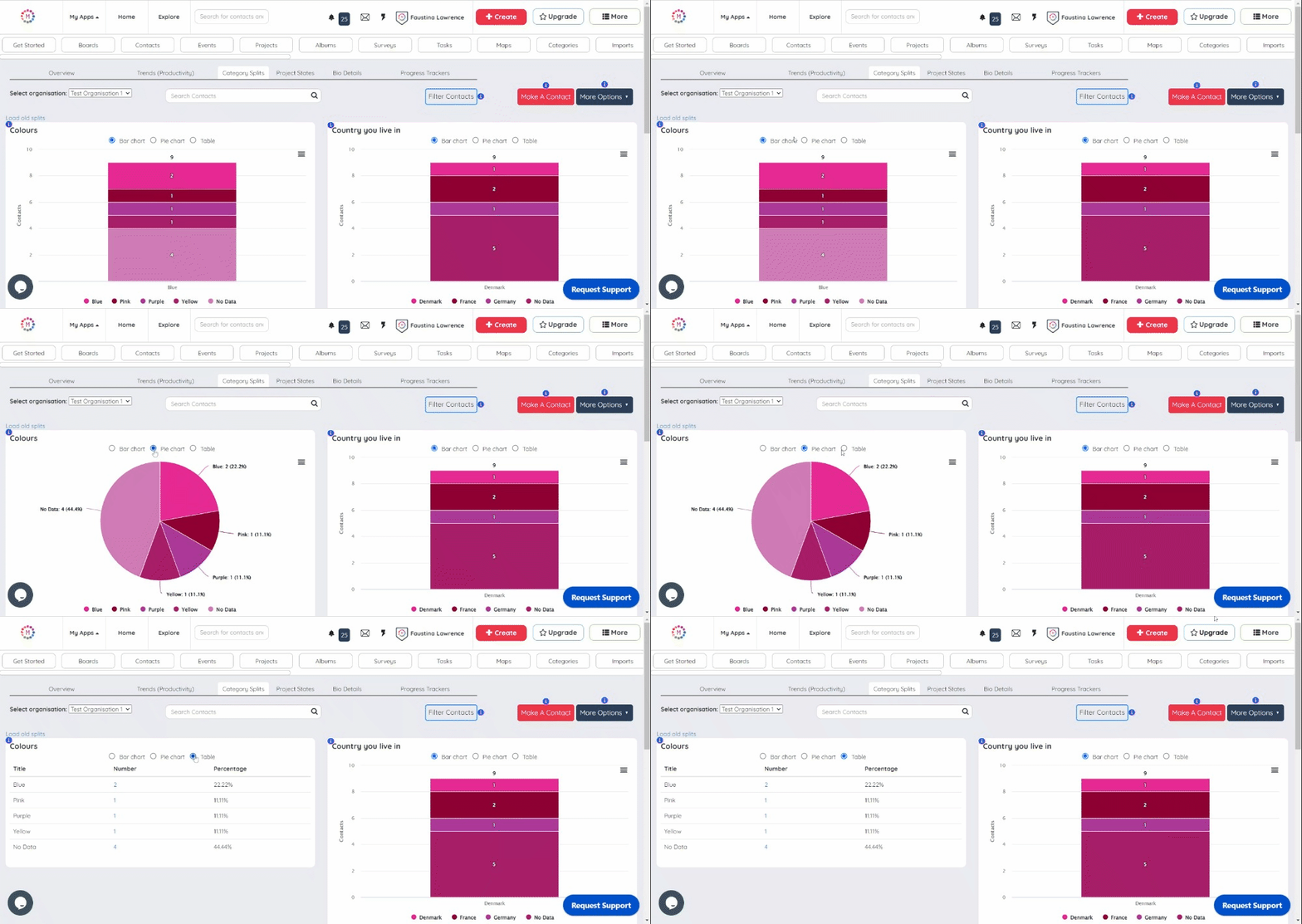
A new feature that visually represents contacts' data completeness, showcasing both the total data, data not entered and the data entered in a table, bar chart, and pie chart, providing valuable insights at a glance.
Why do it
Enables users to quickly assess the status of their data.
The inclusion of bar and pie charts makes it easy to grasp the overall picture at a glance.
Users can make more informed decisions and prioritize their data entry efforts.
How to do it
On the Manage Contact page, select the Category Splits tab.
A data box appears for each characteristic (i.e. List field that is used on your Contact Forms)
Click on any one of the three views of the particular data set to check the entered data and the missing data.
For detailed instructions on how to check for missing data go to this Helpdesk article.

